Recently, a professor at NYU, Jay Van Bavel, posted this on LinkedIn:
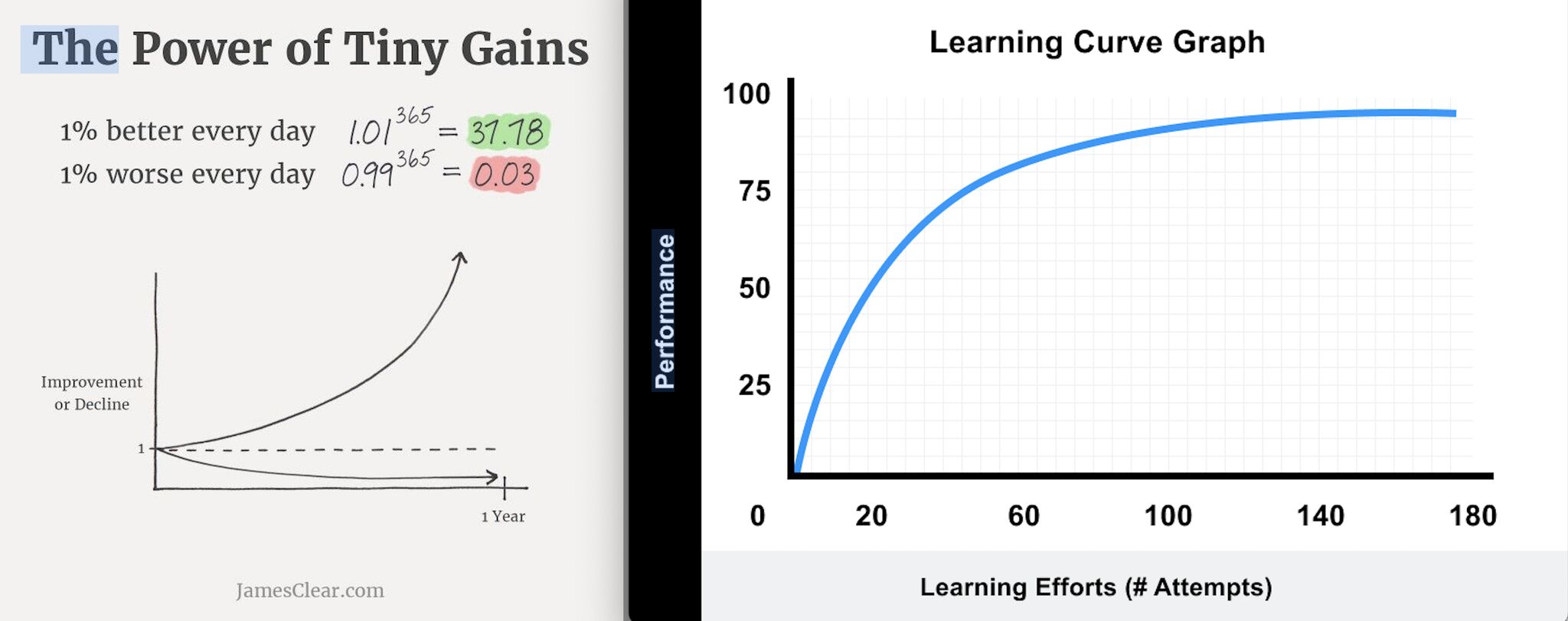
I constantly see people post about the power of tiny gains (image on the left) showing that if simply improve 1% a day you’ll be 38x better in a year(!?!)
While this is technically true, it’s almost never how learning and performance actually change. So it acts as a form of misinformation from productivity gurus and growth hackers.
In fact, if anyone promises anything that will make you 38X better in a year you should instantly call bullshit. It’s impossible on its face.
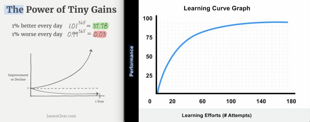
For over 100 years, we have know that the normal learning curve has a rapid rise at the beginning followed by a period of slower learning and then eventually flattens (image on the right).
Alas, the graph on the right is overly simplistic. Improvement at anything is always the result of several smaller things coming together. It’s a dynamic process.
In real life, there are plateaus and bottle necks. There are delays and periods of decline. There are bad teachers, misleading feedback loops, or no feedback loops at all.
The learning curve graph only applies to a very small section of skills, and of those skills, it doesn’t represent any one person’s actual trajectory. I think this graph is just as misleading as Tiny Gains!
There is to graph to summarize improvements—not the Tiny Gains one, and not the learning curve one.
Every improvement is bumpy and uneven.
In one way, Jay is right: the learning curve graph (fast gains followed by a slow rise) is a better way to explain overall improvement: real life is not about constant compound interest.
And yet:
I’m not so sure. you should see the other comments below—apparently the learning curve is extremely robust across contexts. Your blog post only focuses on CrossFit, from what I can tell. But if you have alternative data showing it’s only in a few small contexts I’d love to see it.
Yes, I have data. It’s called real life.
I have data showing that one graph does not represent everything.
I have data showing that one smooth line sloping up does not represent all of humanity’s improvements.
Even decent graphs can only show averages. And your life is not average. Your life will never look like a smooth rise.